Enable / Disable the responsive design: nopCommerce allows store owners to enable or disable the responsive design. By default, this feature is enabled and available on this location: Administration > Configuration > Settings > General And Miscellaneous settings > "Responsive design supported"
A lot of users post questions about why their images are not responsive when posted on topic pages even when the theme is responsive. Today. we will discuss the solution that can fix this problem.
Let us create a sample topic page and post some content & an image on it like this:
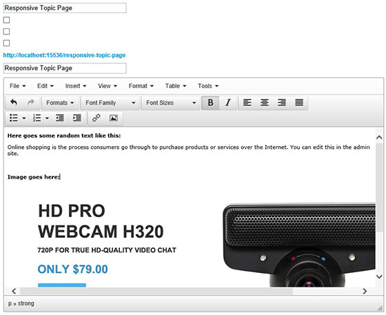
This is how the topic page looks like on a desktop:

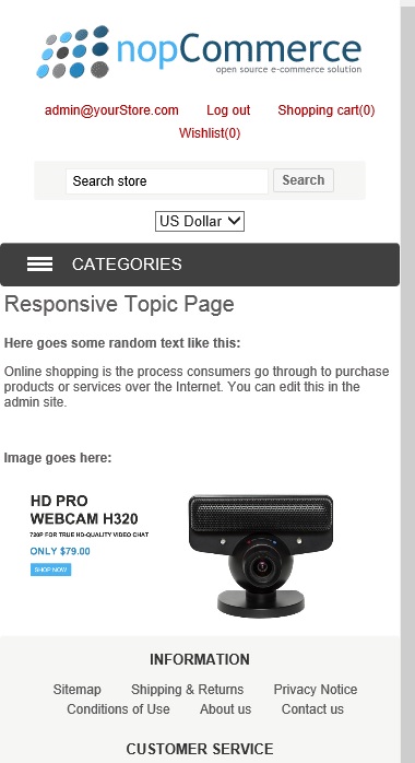
As, you can see in the screenshot above, the image is quite wide but one would expect that the image will re-size itself when viewed on a smaller screen. But unfortunately, the image does not adjust when responsive theme is active. Here is the result:

In order to fix this issue there are 2 different solutions:
Solution 1: Simple add this CSS code in your theme style.css
.topic-page .page-body img { width: 100%; height: auto;}Solution 2: Go to the source code in the html editor of topic and add this to the image tag:
style="max-width: 100%;"Like this:
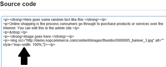
In both cases, the issue will be resolved and you should get the results like this:
Hope it helps!
Nice article.
I fix my issue 100%. :)